Creating forms that elegantly handle validation in an accessible, maintainable and extendable way is a challenge. Using zod and react-hook-form we can take a declarative approach that decouples our form, validation and component logic.
We'll be using the following libraries:
- zod: Runtime validation allowing us to declare schemas that parse data users input and generates a validation message.
- react-hook-form: Gives us a hook to control our form and trigger validation.
- Material UI: Component library to style our form input fields.
It should be noted that apart from react-hook-form, these libraries are interchangeable. For example, you could use io-ts instead of zod to define your form schemas, or Bootstrap instead of Material UI.
Rendering a Simple Field
Let's start by creating a simple uncontrolled field for the user to input their email.
1<form noValidate> 2 <TextField 3 name="email" 4 label="Email" 5 required 6 placeholder="example@mail.com" 7 /> 8</form> 9tsx
A few things to note:
label="Email"defines the visual label on the MUI (Material UI) component, whilename="email"is the native HTMLnameattribute which allows the browser to make suggestions among other things (so you can quickly enter the email you've used on other sites). This may not be desirable in some cases, so you can choose to omit thenameprop or addautoComplete="off"to theformelement.- We use
noValidateon theformto disable native HTML validation. We'll be using our own customzodcodec to define our own flexible validation rules to and have a consistent UX across different browsers. - We haven't specified an
onChangeorvalueprop, so the field is currently uncontrolled. We'll be usingreact-hook-formto manage this for us. requiredadds an HTMLrequiredattribute which has accessibility properties, and adds a*to the label.
Controlling the Form
Let's introduce react-hook-form to control this input. The core of this library is the useForm hook, lets add that to our form:
1const { control, handleSubmit } = useForm({ 2 defaultValues: { 3 email: "", 4 }, 5}); 6tsx
At the moment, we only have a single field so we're just saying that our email input field is empty by default. You'll also notice we don't have anything describing the 'shape' of our form, or any type safety for the data our form contains - keep that in mind for later.
We now have a form control, which allows us to do a lot of magic like watch the data a user inputs into a field, handle validation, and much more. But we need to tell this control what the email input component is. To do this, we wrap the TextField in a Controller like so:
1<Controller 2 name="email" 3 control={control} 4 render={({ 5 field: { value, onChange, onBlur, ref }, 6 fieldState: { error }, 7 }) => ( 8 <TextField 9 name="email" 10 label="Email" 11 placeholder="example@mail.com" 12 required 13 inputRef={ref} 14 value={value} 15 onChange={onChange} 16 onBlur={onBlur} 17 error={Boolean(error)} 18 /> 19 )} 20/> 21tsx
This does a few things:
name="email"on theControllertells our form controller (control={control}) which field this is. Again, this is different to thename="email"onTextFieldwhich is used by the browser for suggestions, etc.renderpasses a few props into the MUITextField:valueandonChangeso that the input can be managed byreact-hook-form.refso that the controller can move the user's focus to the input field (e.g., when trying to submit the form and the field is in an invalid state).errorjust gives the MUI component a red outline to make it visually clear when the field is invalid.onBlurso that the controller can trigger events (such as validation) when the user is no longer focusing the input.
Note that react-hook-form can also register fields instead. Since we're using a component library, we need to use a Controller, but register will work if you're using a custom HTML input.
Let's also add some logic to submit our form:
-
A button within
form:1<Button type="submit">Submit</Button> 2tsx -
A function to run on submit (this could be submitting form data to an API, etc.):
1const onSubmit = (data) => console.log(data); 2tsx -
Then hook it up to our
formwith the prop:1onSubmit={handleSubmit(onSubmit)} 2tsx
You should now be able to hit the button and see a JSON object with your inputted email logged to the console. But we have a few problems:
- The email is required, but we can still submit our form without specifying it.
- We can enter an email in an invalid format, and our form will still accept it.
- We don't have any way to display messages to the user when these validation rules fail.
- As mentioned earlier, we still don't have good type safety.
Creating a Schema
First, let's make the email field required. To do this, we're going create a zod schema. While this is a relatively simple example, a library like zod allows us to:
- Define a set of validation rules and a dynamic message we can display to the user depending on any violated rule.
- Allows us to infer TypeScript definitions from that schema.
transformorcoercedata inputted by the user. Maybe we need to convert anunknownsomething to anumber, or strip whitespace. Importantly, this 'parsing' logic is tied to the validation logic and happens at the boundaries of our application.- More generally, gives us runtime type checking, so we can make sure the raw data inputted by the user is in a form that our application can consume (why is this important? Read this).
We're going to start with:
1const formSchema = z.object({ 2 email: z.string().nonempty(), 3}); 4type FormFields = z.infer<typeof formSchema>; 5tsx
then pass it to the useForm hook using the zodResolver from @hookform/resolvers:
1const { control, handleSubmit } = useForm<FormFields>({ 2 mode: "onBlur", 3 reValidateMode: "onBlur", 4 resolver: zodResolver(formSchema), 5 defaultValues: { 6 email: "", 7 }, 8}); 9tsx
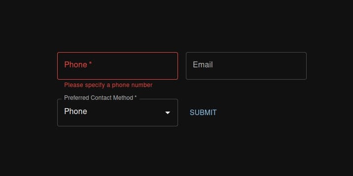
Boom. You should be able to hit submit without specifying an email, then the outline will turn red and be focused. We don't disable the submit button if the form is in an invalid state. This allows the user to more easily identify what in the form is invalid (you can imagine how important this is in a much larger form than this). You may want to render the button differently, but it should still be interactive. Let's break down what's happening here:
- We define that the
emailfield is astring()that isnonempty()usingzod. Fields inzodarerequiredby default. The nice thing aboutzodis that by default it strips any unexpected keys that aren't defined in schema, which makes your application more secure (read more). - We
inferthe TypeScript typeFormFieldsand pass it to theuseFormtype param, so now the outputdatais properly typed and anyControllerwe define. - Set the validation
modetoonBlur. This is ideal for accessibility, since the user validation status doesn't constantly change as the user types, but they don't need to submit before knowing whether that field is valid or not. We also setreValidateModeso that the behaviour is consistent after the first submit.
It's worth noting that react-hook-form has it's own built-in rules, but these don't give us anywhere near the flexibility of zod.
Displaying a Validation Error
Next, let's improve this by rendering out the validation message to the user. Update the render prop within the Controller:
1render={({ 2 field: { value, onChange, onBlur, ref }, 3 fieldState: { error }, 4}) => ( 5 <FormControl> 6 <TextField 7 name="email" 8 label="Email" 9 placeholder="example@mail.com" 10 required 11 inputRef={ref} 12 value={value} 13 onChange={onChange} 14 onBlur={onBlur} 15 error={Boolean(error)} 16 /> 17 <FormHelperText 18 sx={{ 19 color: 'error.main', 20 }} 21 > 22 {error?.message ?? ''} 23 </FormHelperText> 24 </FormControl> 25)} 26tsx
We're using the MUI FormControl and FormHelperText to associate an error message with the input field, if one exists.
Now we can see an error, but not one that is particularly readable:
String must contain at least 1 character(s)
That's because we're using the built in zod error reporter. We can define our
own message instead:
1const formSchema = z.object({ 2 email: z.string().nonempty("Please specify an email"), 3}); 4tsx
However, we still allow an invalid email. Thankfully, zod has a built in
email() schema:
1const formSchema = z.object({ 2 email: z 3 .string() 4 .nonempty("Please specify an email") 5 .email("Please specify a valid email"), 6}); 7tsx
Now we have a dynamic error message to help the user identify what they got wrong.
Adding Another Field
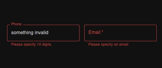
Let's extend our form with an optional mobile phone number. This has some implications to consider:
- We need to make sure the input only contains digits. But a user might try to enter the number in different formats (
0400-000-000or0400 000 000). - It must be exactly 10 digits long.
- It must start with "04".
Let's translate that into schema:
1const mobilePhoneNumberSchema = z 2 .string() 3 // Remove all non-digit characters. 4 .transform((value) => value.replace(/\D/gu, "")) 5 // Must be 10 digits. 6 .refine((value) => value.length === 10, "Please specify 10 digits") 7 // Mobile, Cellular, and Satellite services use the code 04. 8 .refine( 9 (value) => value.startsWith("04"), 10 "Mobile numbers must start with '04'" 11 ); 12tsx
There are two new parts to this schema:
transformallows us to manipulate the raw value inputted by the user.- Instead of using a built-in validation rule like
email, we define our own custom checks withrefine.
Now we need to add it to the form schema:
1const formSchema = z.object({ 2 phone: mobilePhoneNumberSchema, 3 ... 4tsx
set the default in the useForm hook:
1 defaultValues: { 2 phone: '', 3 ... 4tsx
and add the input field within the form:
1<form noValidate onSubmit={handleSubmit(onSubmit)}> 2 <Controller 3 name="phone" 4 control={control} 5 render={({ 6 field: { value, onChange, onBlur, ref }, 7 fieldState: { error }, 8 }) => ( 9 <FormControl> 10 <TextField 11 name="phone" 12 label="Phone" 13 placeholder="0400-000-000" 14 inputRef={ref} 15 value={value} 16 onChange={onChange} 17 onBlur={onBlur} 18 error={Boolean(error)} 19 /> 20 <FormHelperText 21 sx={{ 22 color: 'error.main', 23 }} 24 > 25 {error?.message ?? ''} 26 </FormHelperText> 27 </FormControl> 28 )} 29 /> 30 ... 31tsx
One last thing - we want to make the field optional. We could update some logic in our reusable mobilePhoneNumberSchema, but we might want to use that in other parts of our app where it is required. Instead, let's try adding .optional() to mobilePhoneNumberSchema in the formSchema.
Looks good right? Well not quite. What happens if we enter something, then delete it? It still says:
Please specify 10 digits
So we aren't quite there. This is because .optional() actually only checks if the value is undefined, and once the field is dirty, the value instead becomes an empty string. There are a few other cases where this can happen, such as an MUI select component being null. Here is a helper that will preprocess (similar to transform, but happens before parsing) empty strings and nulls to undefined to make the optional behaviour work as expected:
1const looseOptional = <T extends z.ZodTypeAny>(schema: T) => 2 z.preprocess( 3 (value: unknown) => 4 value === null || (typeof value === "string" && value === "") 5 ? undefined 6 : value, 7 schema.optional() 8 ); 9tsx
Now we can wrap the mobilePhoneNumberSchema with that utility and get the behaviour we expect:
1const formSchema = z.object({ 2 phone: looseOptional(mobilePhoneNumberSchema), 3 ... 4tsx
Some Extra Gotchas
-
Make sure you only specify
requiredon the input component when it is also required in schema. -
You may have multiple forms or even nested forms in complex scenarios, in which case a button with
type="submit"might get in your way and trigger submit on multiple forms (very annoying). This is because native HTML is once again getting in our way, you can override it by changing theformonSubmit:1onSubmit={(event) => { 2 // Prevent the event from triggering other active forms. 3 event.preventDefault(); 4 event.stopPropagation(); 5 6 void handleSubmit(onSubmit)(event); 7}} 8tsx -
If you need to coerce a value (e.g., a
Datevia MUI date picker), you can usez.coerce.date()in addition to other primitives respectively. However, you may want a custom validation message in some cases, in which case you'll need to use an error map instead:1z.date({ 2 errorMap: (issue, ctx) => 3 issue.code === z.ZodIssueCode.invalid_date 4 ? { message: "Please specify a date" } 5 : { message: ctx.defaultError }, 6 coerce: true, 7}); 8tsx
Wrapping Up
Using these three libraries, we are able to decouple our form, validation, and component logic, meaning we can easily define reusable schemas, or swap to a completely different component library with ease. We also get the safety of runtime type checking, while having accessible user-friendly forms with helpful validation messages.
You can find the source code for the example on Stackblitz.
Further Reading
- Creating Custom io-ts Decoders for Runtime Parsing
- Parse, don’t validate
- See the next post in this series where we'll implement a new field for the user's preferred contact method and add conditional validation: https://timjames.dev/blog/validating-dependent-fields-with-zod-and-react-hook-form-2fa9